Marketers and designers are creative people, which means they are not always able to be critical of their own creativity. Together with the connivance of their leaders, this leads to various kinds of curious situations. In today’s review – the most ridiculous company logos.
BY TOPIC: There are 16 circles in this picture, can you see them?
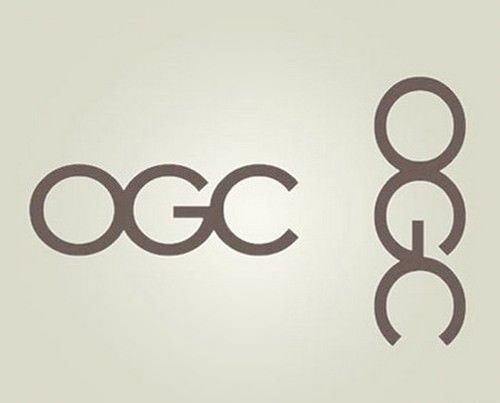
This logo was designed by a British company specifically for the UK Department of State Trade, for which about 14 thousand pounds of budgetary funds were issued. Everything would be fine, but the logo was printed on ballpoint pens, and in an upright position (in the photo on the right) it does not look as formal as the government demanded. officials.

BY TOPIC: “Torn travelers”: unusual sculptures by Bruno Catalano.
After scandals with Catholic priests and high-ranking officials, in the United States, every textbook, magazine or website was scrutinized for material that in any way hinted at pedophilia. However, residents of Arlington can only laugh at such censorship, because every day they see the logo of the local pediatric center.

BY TOPIC: 29 logos with a masterpiece of hidden subtext.
The management of the “Kids Exchange” store noted similarly by placing a sign without spaces. It’s hard to believe that none of the staff at the children’s mall noticed anything out of the ordinary (“Kid Sex Change”).

BY TOPIC: Leonardo da Vinci’s man with outstretched arms: what is the meaning of the picture?
But there are practically no complaints about the creators of this logo for the PC maintenance and assembly service. A mouse is just a computer mouse.

BY TOPIC: It seemed: 70 photos with optical illusions from real life.
It is very good that on the sign of this dental clinic, next to the logo, there is an inscription with the word Dental. Thanks to this, the brain automatically switches to dentists and no more pornography is observed in the picture.

BY TOPIC: The hidden meaning of the logos of famous companies.
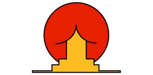
But this institute of Oriental studies (presumably located in Brazil) very well demonstrates the harm from stereotyped thinking. The author did not come up with anything better than to depict a roof traditional for oriental architecture against the backdrop of a huge rising sun. The result is obvious.
BY TOPIC: How many years do trees live (table).
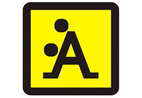
Judging by the sign, this school teaches cheerleading girls, as well as hip-hop dancing. The logo depicts a couple dancing jazz. Or is it a bust of one of the cheerleaders?

BY TOPIC: Hell for a perfectionist: 50 photos that destroy harmony.
Fashionable Italian clothing brand, comments are superfluous.
BY TOPIC: Why is the Apple logo a bitten apple?
And this is the logo chosen by a company that sells maple syrup in New England.

BY TOPIC: 7 Famous Symbols You Might Not Know About.
It is difficult to say for what specific reason the company went bankrupt. Megaflicks from Florida, but the logo could be a good excuse.

See also:
.
The post TOP 10 Examples of Ridiculous Company Logos appeared first on Gamingsym.
