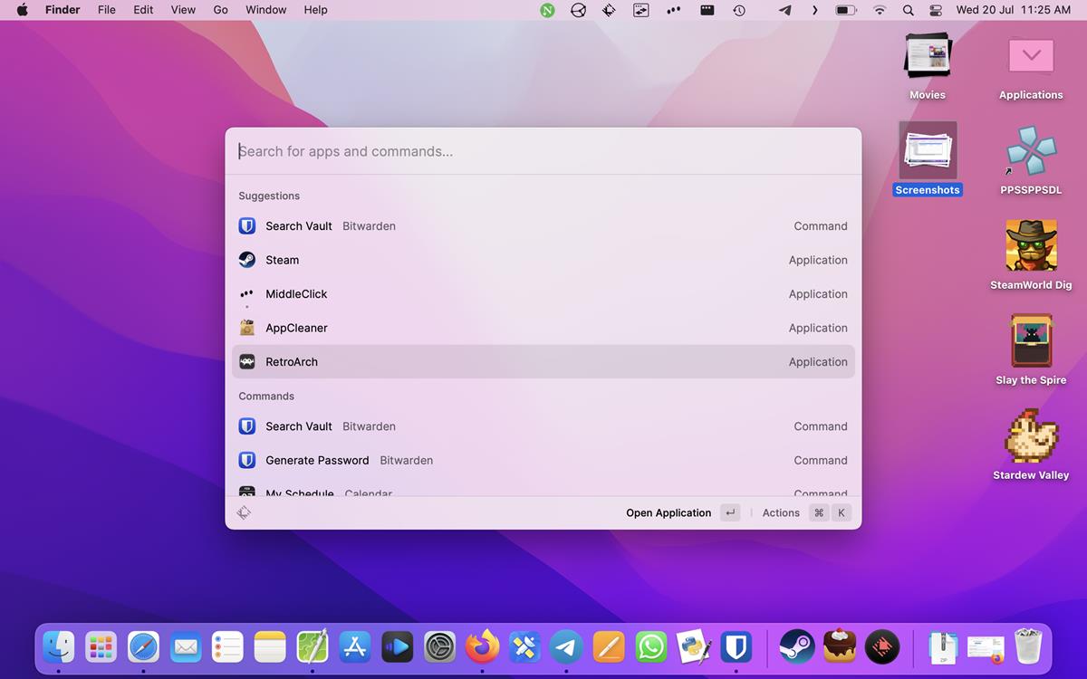
Raycast for macOS has been updated to version 1.38.0. It brings a redesigned UI to the keystroke launcher app, along with some new features.
What’s new in Raycast 1.38.0
Search Bar
The search bar in Raycast is now bigger, almost the same size of Spolight’s search bar. The new style makes it visually easier to distinguish the bar from the search results, though I don’t think it was difficult to use in the first place.
Action Bar
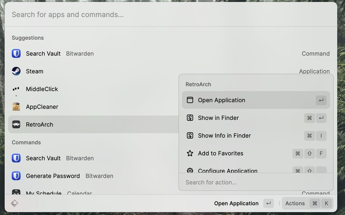
Raycast is more than a search tool, it can perform various actions based on the words that you enter, that’s what makes it a useful tool to have in your arsenal. You can view the commands associated with a keyword that you typed, by using a simple hotkey, Command and K. This brings up a panel from which you select specific commands. If you completed the in-app tutorial, you should know to use it. But, it turns out that some people had difficulty accessing the commands, which is why the latest update adds an Action Bar at the bottom of the window, to help them.
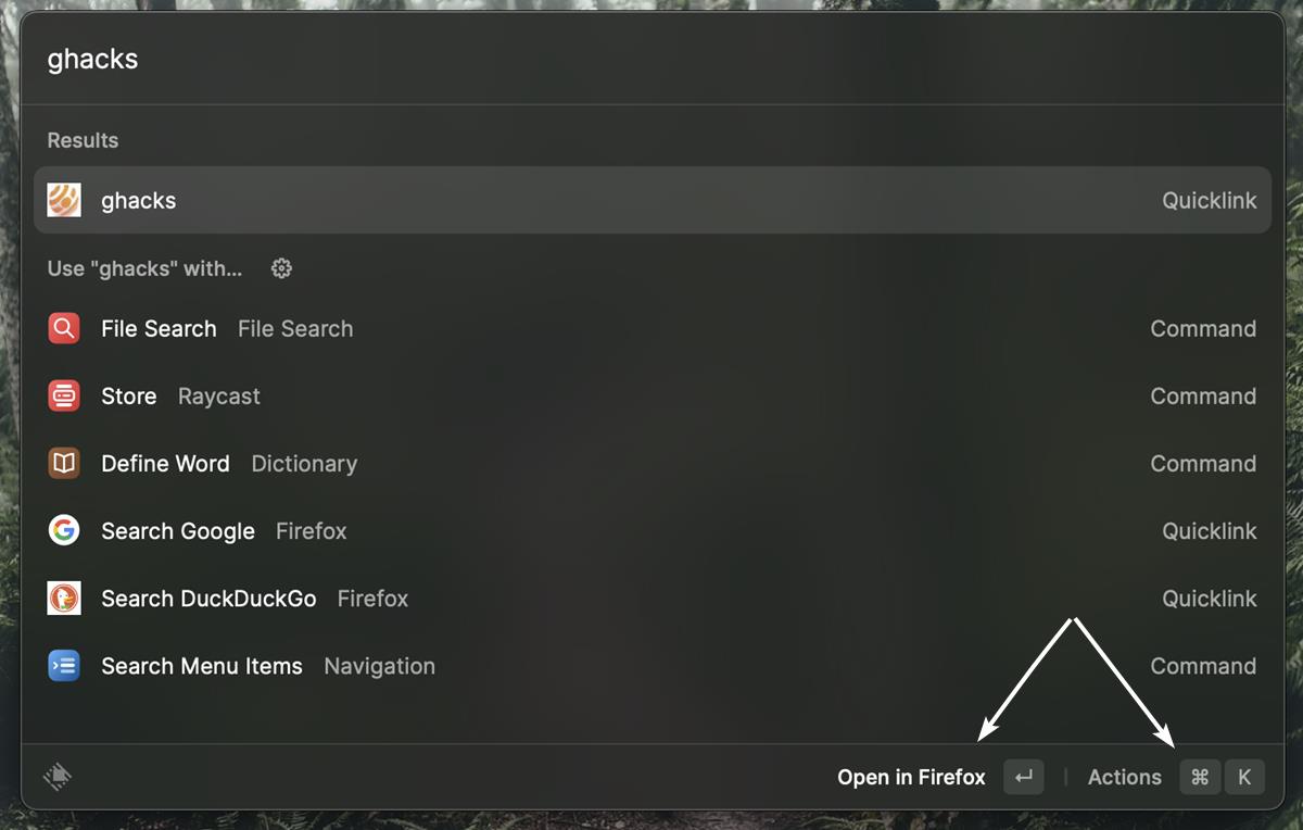
When you input text in the app, the Action Bar will display the primary command that you can execute, along with a button that acts as a shortcut for the Actions. Click on the button to view a pop-up with a list of options that you can choose from. For example, if you run a file search, the options will include opening the file, show in finder, quick look, open with etc. They are just a click away.
Compact Mode
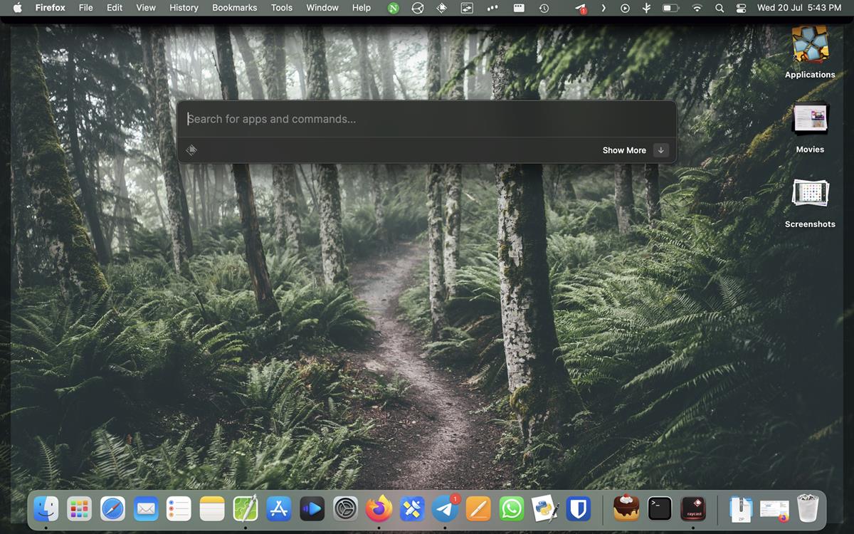
There is a new way to use Raycast, Compact Mode. The option can be toggled under Raycast > Preferences > General section. Click the Compact Mode option, and it’s ready to use.
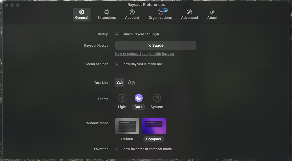
Open the launcher, and you should see just the search bar (sans the long list of shortcuts). But when you begin to type something, the interface expands to its normal view, i.e., to display the relevant results. So, what makes it so special? It doesn’t open the full interface immediately when the hotkey is invoked, so that maybe useful if you want to view what’s behind the panel, before typing your query.
Raycast has a new icon that resembles a key cap, because it is a keystroke launcher. The icon set in the app has been redesigned as well. There has been no change to the core functionality of the app, so these subtle changes are nice.
![]()
The Action Bar is a nifty addition, but there is no option to toggle the bar. I would’ve preferred a more minimalistic approach, especially in compact mode. It would have been better if the options only appeared after hitting the Return key, instead of an as-you-type basis.
The new interface is available in Raycast 1.38.0, you can download the app for free from the official website, or install it via Homebrew.
I don’t have Alfred’s Powerpack (premium version), so I don’t know how its workflows compar to Raycast’s extensions and workflows. I just use the latter because it’s free, and some extensions are useful for me (Bitwarden, Capture full page screenshots, Steam search, etc.), and I like the quicklinks, snippets and the clipboard manager.
Do you like the new design in Raycast?
Thank you for being a Ghacks reader. The post Raycast for macOS gets a new UI, Action Bar and Compact Mode appeared first on gHacks Technology News.
